The Web can be frustrating to use these days. Videos and animated GIFs start playing automatically; your cursor movements trigger unexpected events; ads expand and shrink, pushing and pulling the content around; windows pop up or slide in as you scroll; and, weighted down with scripts and server calls, pages take seconds rather than milliseconds to load. Some websites almost feel as if they were designed to put obstacles between you and what you want to accomplish online.
When was the last time you had a really good experience online, one that made you think, boy, that was much easier than I expected? Maybe it was even pleasant or fun?
What are the differences between these two types of experience? What makes one website more usable than another?
Designers have actually put a good deal of thought into answering this question. There are some well-known definitions of usability, such as that from Jakob Nielsen, one of the leading experts on user-friendly design and user research. There is even an international standard that defines usability.
But I like to think of usability less as an abstract definition, and more as a set of characteristics that any usable system should have. There are some well-known design guidelines for usability, the ten from Jakob Nielsen being probably the best known. But I have boiled them down to four basic characteristics:
A usable system…
- Is accessible to all the people who might want to use it
- Always lets you know where you are, what’s going on, and where you can go next
- Is well-behaved: logical, consistent, and predictable
- Helps you avoid errors, but if you make one it will let you know, and give you ways to recover gracefully from your mistake
Let’s look at each one of these characteristics in turn, and how they might apply in some specific circumstances. Also, you might have noticed that I started out talking about websites, but have now shifted to the broader term “systems.” These are general principles of usability that can be applied to any system, from computers, to photocopiers, to circulation desks.
Accessible to All Who Might Want to Use It
If someone wants to use your website, or your library’s computer, or your photocopier, there should be as few barriers as possible to them doing so. In website design, this means your website should work just fine regardless of what computer system or browser someone uses, or whether they use a desktop, laptop, tablet, or phone.
Similarly, if any of your users have impaired vision or other disabilities, your website and other systems should still be easy for them to use.
Finally, a usable system avoids language your users might not understand. This can mean making translations into other languages available, but it also means avoiding jargon or culture-specific terms that many of your users won’t understand.
Always Lets You Know Where You Are
Have you ever been lost in a mall or campus, getting increasingly frustrated as you wander around looking for a useful map? Now imagine that you find one, but it doesn’t have a prominent You Are Here indicator on it. Usable systems give you lots of tools for figuring out where you are, and clear signs telling you where you should go to accomplish your tasks.
For websites, that means your menus and other navigation links use clear and descriptive terms, giving users a good sense of what can be found on each page. Usable sites also give you clues to where you are within the structure of the site. Some sites use “breadcrumbs”–little links usually near the top of the page that show the path back to the homepage. Navigation links can also change appearance to indicate what section of the site you’re currently in.
Usable systems also let users know what’s happening. A spinning wheel or progress bar, for example, indicates that a webpage is still loading, or a download is still in progress. Computers and other machines should clearly indicate when they are ready to use, or in the midst of a process that will affect the user’s experience.
Is Well-Behaved
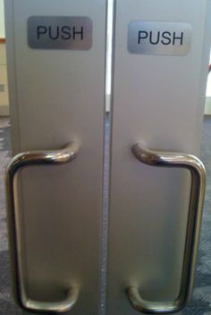
Well-behaved systems are logical, consistent, and predictable. On a well-behaved website, for example, a link will always look like a link, and events like a video beginning to play, or an image getting larger or smaller, won’t happen until the user purposely triggers those events. The text of a hyperlink won’t promise one thing, like the library’s hours, but instead open a page describing the library’s history. A clickable button will always look like a clickable button, regardless of what page you’re on. That’s consistent, logical, and predictable behavior.
We want that same good behavior from other systems. Imagine, for example, that where you went to check out books in the library changed from day to day. Or that the power button on your photocopier looked exactly the same as the Copy button. Such inconsistent and unpredictable behavior would almost certainly leave your users frustrated.
Helps You Avoid & Recover from Errors
At one point or another, we’ve all said a prayer of thanks for the “undo” function in a word processor, or the “are you sure you want to do this?” message before deleting a file we didn’t mean to delete. These are ways software systems help us avoid errors and recover gracefully from our misclicks and uninformed choices.
Easily accessible links, clear language, and good navigation on a website are other ways to prevent user error and allow for easy recovery. A “page not found” message on a website will tell the user that the page they wanted is not there, but it could be more useful by also suggesting other pages or allowing the user to search for the page they wanted.
In other systems, clear signs and instructions can help users avoid errors, and knowledgeable, helpful, and readily available staff can help them recover gracefully.
How to Tell if a System is Usable
One way to tell if a system is usable is to simply take a list of the characteristics of a usable system and ask yourself if your website, ILS, reference desk, or what-have-you, has these characteristics. That’s a start. But the best way to know is to evaluate the system with actual users.
Simple user research methods, done with only a handful of participants, can give you lots of useful information about ways to make a system more usable. Plus, there are lots of great free or very inexpensive resources that can help you get started.
One of the best places to start is Usability.gov. It’s a great source for usability guidelines and user research how-tos. In particular, see their User Research Methods section for overviews of various kinds of evaluations.
The Nielson Norman group is a leading usability research and consulting agency, and they frequently publish reports that are appropriate even for those new to user research. Nielsen’s Usability 101 article is a good introduction to the principles of usability and user research.
Finally, I highly recommend the books Don’t Make Me Think and Rocket Surgery Made Easy, by Steve Krug. His business name, Advanced Common Sense, nicely sums up his philosophy on usability. His books focus on the usability of websites, but, as I’ve argued, these principles and research methods can be applied more broadly.
So is it worth designing usable systems? I don’t know anyone who would answer no to that question, and yet it’s easy to let other priorities take precedence in the course of day-to-day life. I invite and encourage you to take a moment (or longer) evaluate the usability of your systems, and to think of this work as part of your overall patron-service strategy.
Featured image: “key” from KK Studios series, The Uncomfortable

- The Only Diagramming Tool You’ll Ever Need (And It’s Free!) - February 21, 2019
- Talking Book Library Named Network Library of the Year - May 17, 2018
- Google Analytics Basics: Users, Sessions & Pageviews - March 5, 2018