A List Apart is one of the pioneering sites for web design, having been at the forefront of many important web design movements, such as standards compliance, responsive design, and css-grid. In addition to the articles on their site, they also publish books and hold conferences about web design. This year they held a special Event Apart in Denver, which I was lucky enough to attend. The talks ranged widely in topics, from new CSS techniques, to Progressive Web Apps, to image optimization, animation methods, and usability research. But many of the talks returned in various ways to improving the performance of sites–making them smaller and faster and more user-friendly–and how sites could still express the individual artistry of the designer.
There is not necessarily a tension between performance and art, but web design recently seems to be experiencing some growing pains as it becomes more central to larger organizations, produced by trained experts working in larger teams, more shaped by research, testing and analytics, and more homogeneous in its look and feel. Many of the Event Apart speakers were the young pioneers of the early, more individualistic and experimental, years of the web. Now the aged veterans of web design, and some of their younger acolytes, seem to yearn for the days before web design accrued so much bureaucracy.
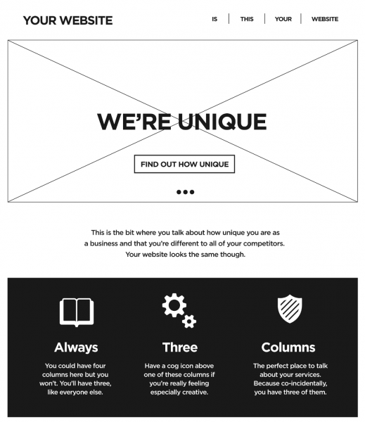
I don’t know if you’ve noticed, but lately all websites look the same. There is a large “hero” image–often an image carousel, which currently rivals Comic Sans as the bête noire of web designers–with your website’s name and nav menu at the top, a big headline and a “call to action” button. Beneath that some text and a row of icons with text that promote three or four features of the site or selling points of the company, and below that maybe a contact form or testimonials from clients.
There are some good reasons why this design pattern has become so widespread. Indeed, some designers have defended the ubiquity of this design, arguing that it reflects what users expect from sites these days, and that it is a natural consequence of the many shared tools designers use. But, for designers who would like their craft to be more of an avenue for artistic expression than a homogenous product, this kind of standardization is frustrating.
More than one presenter at the conference talked admiringly of the experimental early days of web design, when designers were improvising layout tools from table elements and images (see, for example, the old Space Jam site). Some even seemed to yearn for the days of Flash sites, which, whatever the problems with Flash as a technology, were seldom predictable. But unpredictability is seldom a boon to usability–and that is a tension web design will never resolve.
My favorite talk of the conference was by Jen Simmons, who hoped that the new CSS-grid layout tools will help the web be more artistic, but still clear, usable, and performant. A good deal of her presentation was about her research into the principles of print design, and how web designers can learn a lot from print about how to make creative designs that are still readable and clear. Similarly, Cassie McDaniel looked for inspiration in the work of some famous industrial designers, who obsessively designed and redesigned chairs. They produced many versions of these objects that served their utilitarian purpose well, but were still also vehicles for their designer’s individual artistic expression. It remains to be seen if web designers manage the same trick.