The State Demography Office has put together a series of infographics on population change, labor, and households for Colorado back to 1970. (Infographics are short one-page graphs or charts accompanied by quick data, maps, etc.) A quick glance at the infographics shows a significant population increase in Colorado since 2000. Other infographics present pie charts and other graphs showing the state’s age distribution; labor force statistics; and household growth as related to size, age, and household composition. If you need quick facts on population in Colorado, these infographics are a helpful resource. The website also offers the infographics in PDF form so they can be printed as posters, etc.
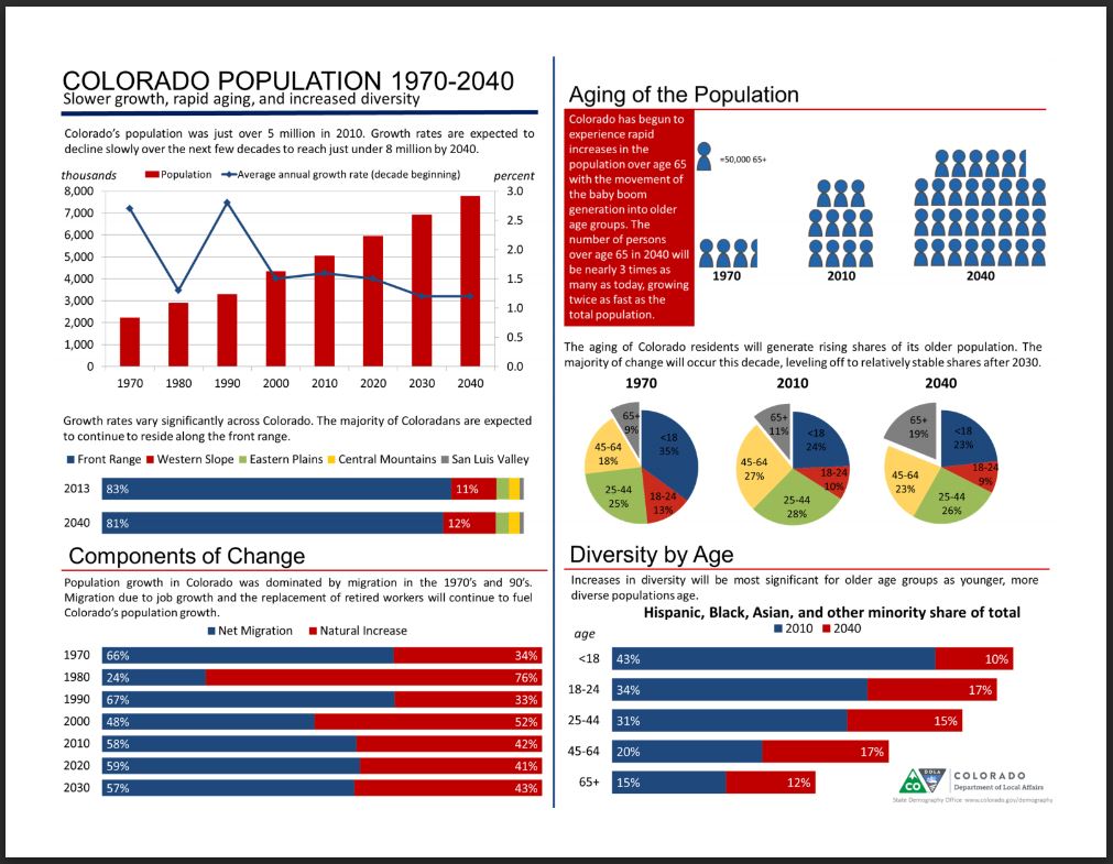 |
| One of the State Demography Office’s infographics. |

Former Technical Services Librarian at State Publications Library
Latest posts by Amy Zimmer (see all)
- How to Spot the Differences Between Eagles and Hawks - August 16, 2021
- How Transportation Projects Help Tell the Story of Colorado’s Past - August 9, 2021
- Time Machine Tuesday: The Night the Castlewood Canyon Dam Gave Way - August 3, 2021